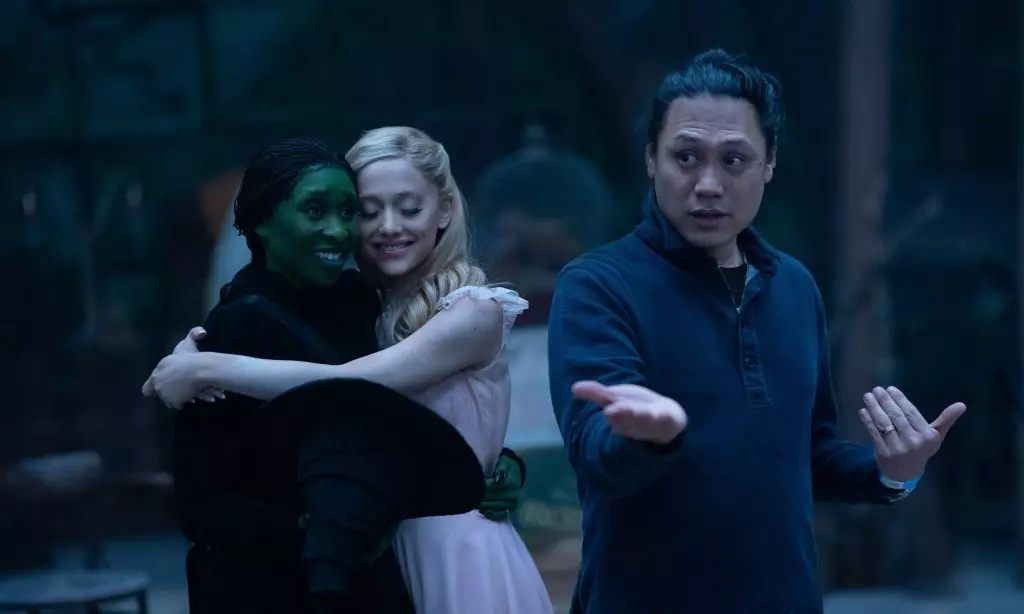
As adaptations of iconic stories continue to captivate audiences, Jon M. Chu’s rendition of *Wicked* stands out for its unique cinematic approach. Having received mixed reactions regarding its color grading when compared to the vibrant technicolor of the 1939 classic, *The Wizard of Oz*, Chu’s vision for this ground-breaking musical pushes boundaries while inviting audiences to reconsider what they expect from a fantasy world. The choice to adopt a more desaturated palette has sparked intense discussions and debates, making it essential to explore the creative reasoning behind this artistic decision.
In conversations surrounding *Wicked*, audiences have expressed disappointment over what they perceive as a lack of vivid color. However, Chu argues that color isn’t merely about visual spectacle; it serves as a means to create a tangible world that feels real and relatable. He emphasizes that the emotional stakes between the characters, particularly the dynamic between Elphaba and Glinda, would suffer if the world was painted in an unrealistic manner. Through this lens, the muted tones serve a purpose: they ground the narrative in authenticity, allowing viewers to connect more deeply with the characters’ struggles and growth.
Chu’s assertion that “it’s not plastic” speaks volumes about his intention. He aims to create a sense of wear and tear that reflects the characters’ journeys. This choice to present a more organic and emotionally vibrant Oz contrasts sharply with previous interpretations that leaned heavily on bright, synthetic colors. By doing so, Chu’s version of Oz becomes a living, breathing entity that engages viewers on both a superficial and emotional level.
The decision to move away from the traditional technicolor look is not merely an aesthetic choice; it reflects broader technological and creative shifts in the film industry. As Chu notes, the technicolor process has become increasingly impractical and expensive. Additionally, modern filmmaking technologies offer new ways of storytelling that can capture the essence of a narrative without the need for vibrant palettes that were once considered standard.
The filmmakers’ choice to embrace natural lighting also plays a significant role in creating an immersive experience. Utilizing the sun as the primary light source helps to showcase the natural beauty of the landscapes, ultimately enhancing the narrative’s thematic elements. This contrasts with the vibrant hues of technicolor and aligns better with the existential struggles faced by the protagonists, making their connection to the land more profound and symbolically rich.
The dialogue surrounding *Wicked*’s visual aesthetic has been fervent. While some critics deride the film’s “drab” color schemes and “backlighting,” others appreciate the intentionality behind those choices. The mixed reception underscores an essential aspect of contemporary film: audience expectations are evolving. With the availability of diverse storytelling techniques and visual palettes, filmgoers now engage more critically with the artistic choices made in cinematic narratives.
Interestingly, this conversation has not hampered the film’s box office success. *Wicked* has shattered numerous records, showcasing its immense popularity despite aesthetic critiques. Its remarkable achievement as one of the highest-grossing openings for a musical adaptation highlights that audiences are still willing to embrace a departure from tradition, indicating a shift in what viewers desire from modern film.
Ultimately, Chu’s decision to prioritize a grounded aesthetic serves a greater narrative function that is consistent with *Wicked*’s themes of friendship, power, and societal norms. It reflects Elphaba’s emotional journey and her growing understanding of her place in the world—an evolution that deserves a backdrop reflective of complexity and depth.
This choice to depict Oz in a new light serves not only the film’s narrative but also encourages viewers to explore complex emotional landscapes ourselves. In a world where fantasy elements often overwhelm deeper storylines, Chu’s choice to use color grading thoughtfully revitalizes *Wicked*, demonstrating that even the most beloved stories can evolve while still maintaining their core truths.
Jon M. Chu’s *Wicked* exemplifies an intricate balance between tradition and innovation, inviting audiences into a world that feels authentic, layered, and real—an Oz that resonates as much today as it did in 1939, albeit in a vastly different hue.


Leave a Reply